Peaks & Pikes
This is the first post on my new blog. I’m just getting this new blog going, so stay tuned for more. Subscribe below to get notified when I post new updates. I’ll be looking at Lake District magazines.
Showing the progress of my A-level media magazine
This is the first post on my new blog. I’m just getting this new blog going, so stay tuned for more. Subscribe below to get notified when I post new updates. I’ll be looking at Lake District magazines.
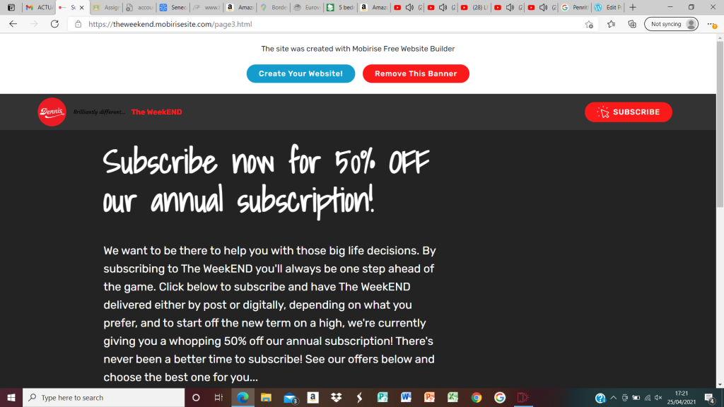
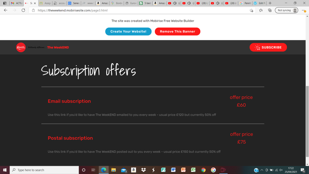
Since finishing the covers and contents pages for the magazine, I have been able to finalise the website to go with the magazine. I have created a homepage, a page for each issue of the magazine and a subscription page. The homepage links to all the other pages. The magazine pages have a link back to the homepage and also have subscription links that work so that there’s a call to action on every page that allows people to subscribe to the magazine in email format or paper format.
The video, which is of Stanley the assistance dog, is featured on the webpage for issue two of the magazine. You can link to both of the magazine pages by clicking on the images of the magazine covers on the homepage.
The homepage also contains the Dennis logo to show this is a Dennis publication.
I know there only needs to be two working pages but it made more sense to do four pages so I could include a page for each of the magazines as well as the subscription and home pages.
This should link to my magazine: https://theweekend.mobirisesite.com/
Please see screenshots below:


Today I have been working on my Contents pages to fill in the gap that was at the bottom of the page. I’ve made a call to action advert for money off a magazine subscription and added it to the bottom of each page. I think this works really well. I may need to adjust the colour slightly but other than that, I think the front covers and contents pages are finished. I just need to work on the website now and remember to put the offer I’ve mentioned (on the contents pages) on the website too.


I’ve spent a lot of time today working on the contents pages within the magazine. I like the way the front covers are looking but the contents pages didn’t match very well so I’ve looked at the format and other examples of contents pages and tried to make mine more in keeping with the magazine. I’ve rearranged the pictures and the text so they are laid out more like other contents pages and I’ve also added the green border around the whole thing which mirrors the front covers. I think it’s starting to look better like this but it has left me with a gap at the bottom of the page which I need to fill. I’ve thought about what to do with this space and thought I could add more ‘contents’ in so the list is longer, but I then thought it might be a good space to have a call to action for the magazine, such as ‘50% off if you subscribe to The WeekEND….’ I think this will work really well as it fills the space but is also a call to action which helps the magazine.
Here is a screen shot of the pages together so you can see the similar layouts but I’ll also screen shot them separately so you can see the work I’ve done.


Today I’ve been working on my front covers and contents pages in Photoshop. I’ve moved some things around so the front covers are less cluttered and the contents pages both now have the social media red banner with the links and logos. Both contents pages and front covers now have a very similar format. I just need to work a little bit on the font sizes, colours, styles at the top of each front cover, where the little pictures are, just to make sure that they are clear and readable.
Issue 1:


Issue 2:


I looked at “The Week” magazines on the internet to see what else I could capture in my “Weekend” design. One thing I worked on today was the green background going around the edge of the magazine. This is to link with the captions at the top explaining what’s inside the magazine. The green colour was chosen to reflect the leaves without actually showing too many of them on the page. The fact that the background is plain keeps it straightforward to look at. Text that’s currently going over onto the green background will be edited in future to keep a neat appearance. Hopefully in the near future any text that going over the edge will be either within the middle of the photo or inside the green outline. I’m still working on the whole design. This is just a work in progress to show what I’ve done today.

Work from today on the cover and contents pages. Sorting out the images a bit more:


I’ve played about with moving the social media logos from the front cover to the contents page and put a tag line on the front cover where the logos were. The tag line is similar to ‘The Week’ tagline but I’ve changed it slightly to work better with my magazine. I think the cover and contents page look better like this. I’ve also added photos to the top of the front of the magazine to show what will be inside this issue. I’m still working on the text here as I’m not happy that it’s clear enough yet.
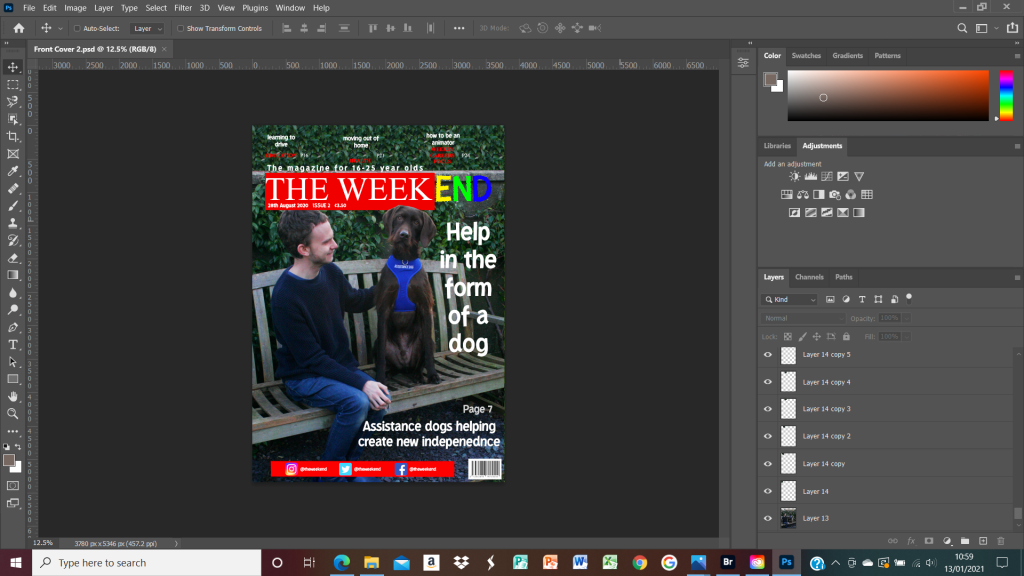
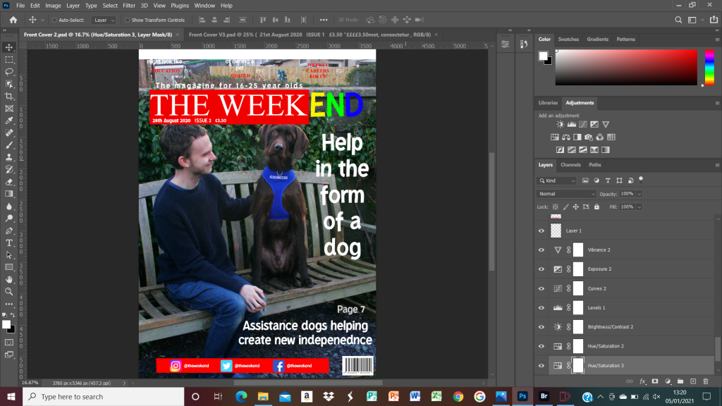
I’ve been working on the cover photo in Photoshop, to cut out the dog’s head so that it overlaps the banner of the magazine name, ‘The Weekend’. It took quite a while to do and was quite fiddly but I think it’s worked. The rest of the cover wording and pictures still need to be sorted out. I’ll be adding photos to the top section like ‘The Week’ has on their magazine and the wording may change. Here is my progress so far:

I’ve made more progress on my second front cover for the magazine. Today I managed to work out how to create a background section for the top of the magazine so that the words would stand out and the background wouldn’t be confusing. I was quite pleased with the progress I made. This cover still needs to be finished but it’s getting there.

Today I’ve been taking photos and working on the second cover for my magazine. It’s not finished but here’s the progress so far so you can see what I’ve been doing.

I’ve been working on the front cover today to try and get the layout a bit more sorted. This basic layout will be good for both magazines and issue 1 is nearly complete, it just needs some more photos and a bit of organising with the text. Below is a screenshot of my progress so far.
